


 Apparel Boxes
 CBD Boxes
 Electronic Boxes
 Jewelry Boxes
 Christmas Boxes
 Soap Boxes
 Bottle Boxes
 Hardware Boxes
 Health Boxes
 Product Boxes
 Pharma Boxes
 Holiday Boxes
 Shipping Boxes
 Pre Roll Boxes
 Pizza Boxes
 Vape Boxes
 Hemp Boxes
 Cereal Boxes
 Bakery Boxes
 Stationery Boxes
 Sports Boxes
 Chocolate Boxes
 Retail Boxes
 Gift Boxes
 Candle Boxes
 Food Boxes
 Tea Packaging
 Cigarette Boxes
 Cosmetic Boxes
 Coffee Packaging
 Cardboard Boxes
 Corrugated Boxes
 Rigid Boxes
 Kraft Boxes
 Custom Tote Bag
 Custom Mylar Bags
 Gable Boxes
 Hang Tags
 Labels & Stickers
 Mailer Boxes
 Paper Bags
 Pillow Boxes
 Trays and Sleeves
 Tube Packaging
 Tuck Boxes
 Window Packaging Boxes
 Display Boxes


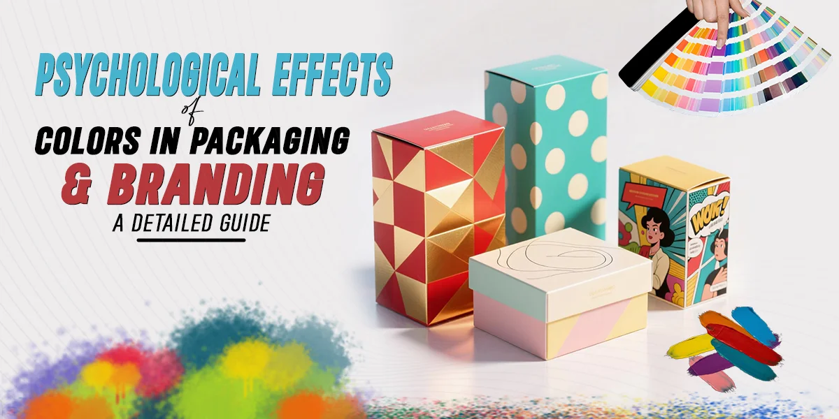
Walk down any supermarket aisle and notice how your eyes move. Long before you read a single word on a label, color has already started talking to you. It tells you whether a product is cheap or premium, calming or energizing, trustworthy or playful. This isn't accidental — it's the result of decades of research into color psychology, and savvy brands use it deliberately to shape how people feel about their products before logic even enters the picture.
This guide breaks down why color works on the brain the way it does, what each major color tends to communicate, and how brands can use this knowledge to make smarter packaging and branding decisions.
Why Color Affects Us Psychologically
Color perception isn't purely visual — it's emotional and physiological. Certain wavelengths of light trigger measurable changes in arousal, heart rate, and mood. Red, for instance, has been shown to increase alertness and even appetite, which is why it dominates fast-food branding. Blue tends to have a calming, trust-building effect, which explains its popularity among banks, tech companies, and healthcare brands.
Color associations are also shaped by culture, memory, and context. Green might universally suggest nature and freshness, but in a financial setting it can suggest growth or money, while in a medical setting it can imply safety or "all clear." Brands need to consider not just the emotion a color evokes, but the context in which their product is being judged.
There's also a learned, associative layer. Once enough brands in a category use a color in a particular way — green for organic food, white for minimalism and purity, black for luxury — consumers begin to expect it. Stepping outside that expectation can either make a brand stand out memorably or confuse the buyer, depending on execution.
What Different Colors Communicate
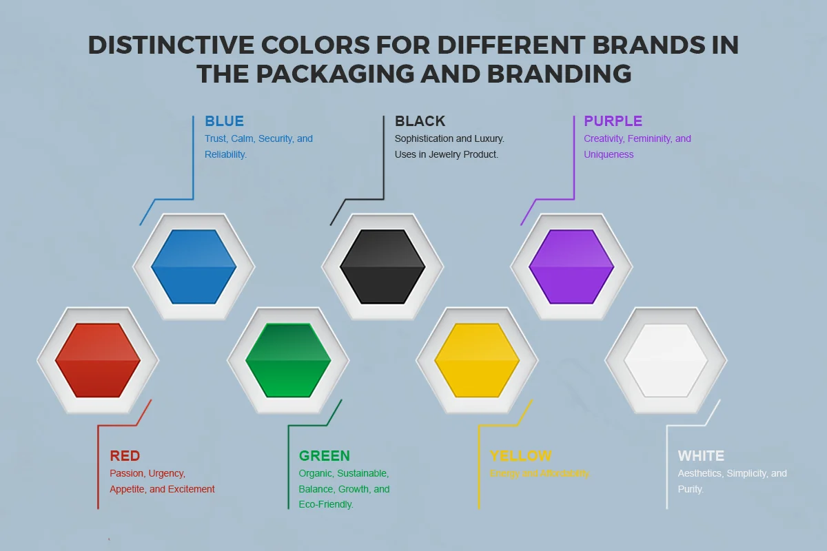
Red is the color of urgency and appetite. It raises pulse rates slightly and draws the eye faster than almost any other color, which is why clearance sale tags, fast-food chains, and energy drinks lean on it heavily. It signals excitement, passion, and sometimes danger — useful for brands that want to feel bold or urgent.
Blue is the most universally "liked" color across genders and cultures. It signals calm, dependability, and intelligence. This is why it's the default choice for financial institutions, healthcare providers, and tech companies that want to appear trustworthy and competent rather than flashy.
Yellow grabs attention and is strongly associated with optimism, warmth, and affordability. It's often used to draw the eye in crowded retail environments or to suggest friendliness and value, though overuse can make a brand feel cheap or, in large doses, even anxious.
Green is shorthand for nature, health, and sustainability. Organic food brands, wellness products, and eco-conscious companies use it almost by default now. It also carries financial connotations (think of "green" meaning money or growth), which is why it occasionally appears in banking and investment branding too.
Black conveys sophistication, luxury, and authority. High-end fashion, premium electronics, and luxury skincare frequently use black packaging because it suggests exclusivity and quality, often allowing a brand to justify a higher price point.
White suggests purity, simplicity, and cleanliness. It's a favorite in minimalist branding, beauty products, and tech packaging because it creates a sense of spaciousness and lets other design elements breathe.
Purple has long been tied to luxury, creativity, and a touch of mysticism, largely due to historical associations with royalty (purple dye was once extraordinarily expensive to produce). Brands aiming for a premium or imaginative feel often reach for purple.
Orange combines the energy of red with the friendliness of yellow. It feels playful, accessible, and enthusiastic — common in youth-oriented brands, sports products, and call-to-action buttons because it tends to drive impulsive engagement.
Color in Packaging vs. Color in Branding
It's worth distinguishing between branding color (the consistent palette tied to a company's identity — think Coca-Cola red or Tiffany blue) and packaging color (which can sometimes flex for specific product lines, seasonal editions, or markets). A strong brand maintains color consistency across touchpoints — logo, website, packaging, advertising — because repetition builds recognition. Studies on brand recognition consistently show that color increases recognizability significantly, which is part of why companies are so protective of their signature shades.
At the packaging level, though, color often needs to do more immediate, tactical work: standing out on a shelf, signaling a flavor or variant, or appealing to a specific psychographic in a specific aisle. A skincare brand might keep its logo a consistent muted green across its whole range, while using lighter pastel accents for a "sensitive skin" line and deeper tones for an "anti-aging" line — same brand identity, different emotional cues layered on top.
Practical Tips for Choosing Brand and Packaging Colors
- Start with your core emotional message. Do you want to be seen as trustworthy, energetic, luxurious, or approachable? Choose colors known to evoke that feeling first, then refine for aesthetics.
- Study your category's color norms — then decide whether to follow or break them. Standing out from a sea of green "natural" products with a bold red can work, but only if the rest of your messaging supports that disruption.
- Consider your target market's cultural context. Color meanings shift across regions; a color that signals luxury in one country might signal mourning in another.
- Test contrast and shelf visibility. A color might evoke the right emotion in isolation but disappear next to competitors under store lighting. Always test packaging mockups in realistic retail conditions.
- Keep accessibility in mind. Color contrast affects legibility for all consumers, including those with color vision deficiencies. Pair color choices with strong typographic contrast so your message isn't lost.
- Be consistent, but allow for strategic flexibility. Core brand colors should remain stable for recognition, while secondary palettes can vary by product line or season without diluting the brand.
Final Thoughts
Color is rarely the whole story in branding, but it's almost always the first sentence. Before a customer reads your tagline or studies your ingredient list, color has already nudged their first impression — toward trust, excitement, luxury, or hesitation. Brands that understand the psychology behind their palette aren't just making something "look nice." They're shaping perception, guiding behavior, and building the kind of instant recognition that turns a product on a shelf into a brand in someone's mind.

